

A well-crafted product label design is critical to your business success. It not only makes the brand statement and identity but also attract new and potential customers to go ahead and try your product. Thus, no matter what product you are selling, the product labels need to be distinctive. The foundation of this lies in using the essential components of a compelling label design to your advantage. Let’s check them out.
Color
Color invariably catches our eye. Thus, its skillful use will attract all customers to glance at your product and perhaps get interested in it. The color needs to be decided basis the container and the way you are presenting information in it. Often white color background is used to create the illusion of space. No matter what combination of color you are opting for, they should gel as one and must never visually clash. You can always take the help of various color mixing tools available online that helps you create perfect combinations.
Graphics
Color and graphics go hand in hand. An eye-catching graphics like stock photography or illustrations can enhance the oomph factor of your label. The only care you need to take here is that you must not breach license agreement. You must always look for graphics which does not require buying a license agreement.
Readability
It is critical that you make the type legible enough using the right mix of font, color, and size. According to experts, most shoppers browse aisles just for 2-3 seconds during which they can catch a few words only. Thus, the label must have your brand name as well as a catchy slogan that would force the customer to pause and explore further.
Fonts
Fonts of the printed graphics would play a critical role in deciding the readability of the text. Thus, its size and type must be given special attention. You can always experiment with it to create something stunning and totally different. Ensure to use typographic pairing to create a visual juxtaposition and making each element stand out.
Material
People often dismiss the importance of the label material, but it is also a critical component to consider. Your design and material should ‘fit’ together. Most popular materials are cream, white or clear textured paper. Clear paper is used for a ‘no label’ look and looks extremely striking against a colored container or product. A textured cream paper with some handcrafted image oozes a vintage look that can be quite charming.
Label finish
Depending on your product, the entire label design, and various other factors, you can decide on a glossy or matt finish. The glossy look is excellent to create a shiny reflective look that is bound to be eye-catching. Simple labels blend well with matt finish.
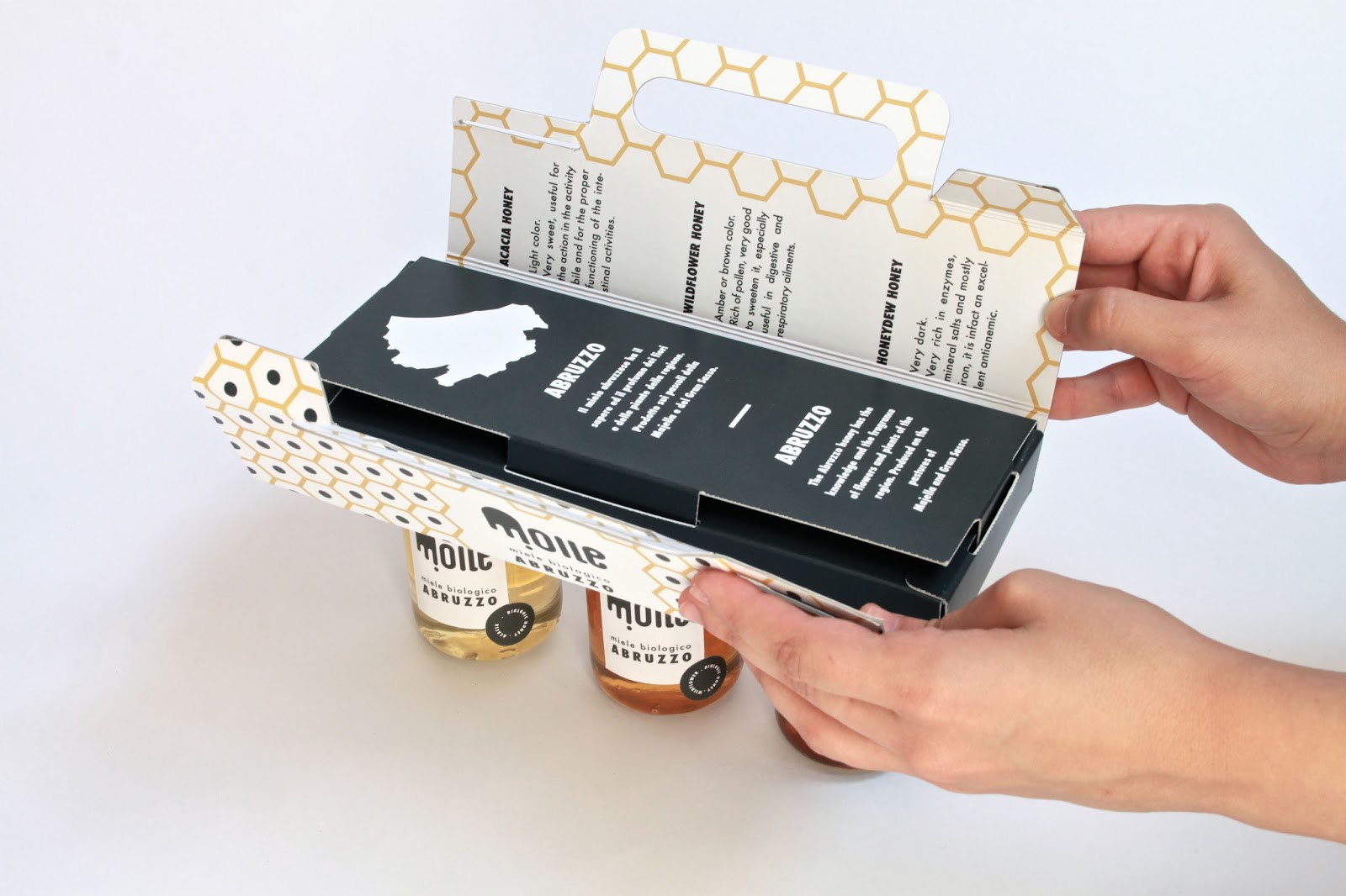
Label shape and size
Depending on the container and the design; you can choose an appropriate shape and size. One can also freely experiment here and create some unusual looks here that will make your product stand out.
Designing a label has no hard and fast rule but utilizing your creativity to the max is the key to success.


Comments